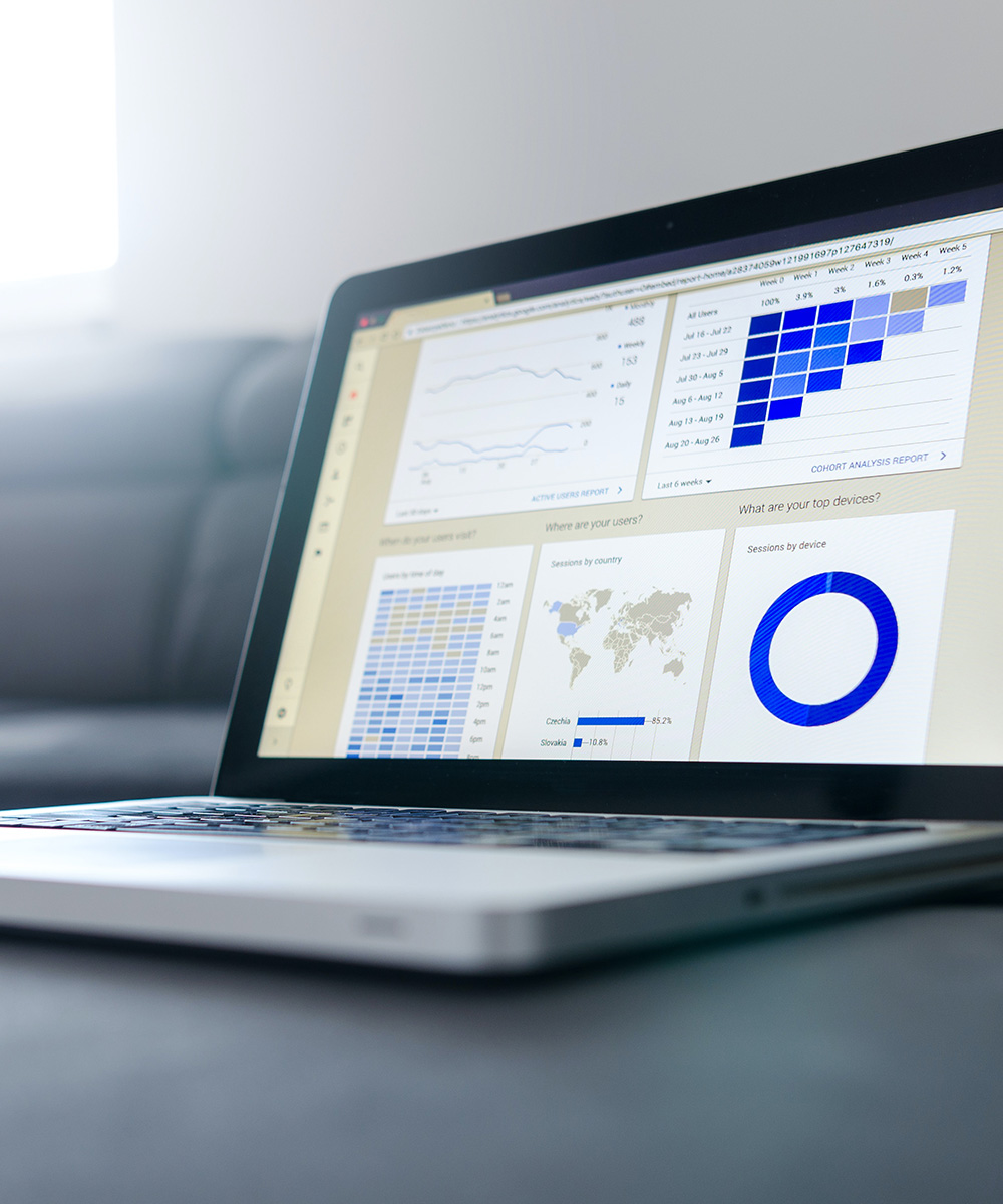
We are now in a digital age, so why are we not using interactive dashboard reporting for every single research report?
Our Business Services Industry Team combines decades of experience with industry expertise to provide actionable and high-quality research to clients in consulting, risk management, financial services, and information analytics. We combine marketing and communications with market research and believe that success in this space can be found at the intersection of practicality and validity.
Our clients think of us as much more than simply a vendor. We serve as a strategic partner. One that you can rely on through each stage of the project. We will be nimble and agile as we think through the findings together and determine actionable steps that will help to positively impact your organization and create the greatest return on your investment.
Analysis and reporting is perhaps the most important phase of a research project – it’s the culmination of all the hard work and thought that went into designing and executing your research strategy. It’s the point where, we as researchers, aim to create insightful and engaging reports that important business decisions will be based on…it’s kind of a big deal!
When creating a report, our number one goal is to bring together research insights and ‘tell a compelling story’, but maybe just as important is how we relay the information.
It’s safe to say that PowerPoint is still the industry standard for market research reporting. We like using PowerPoint for reporting because it provides a great deal of flexibility to customize how we present the data and tell the overall research story. On the practical side, it’s easy to use, and if you’re creative, can provide a ‘wow factor’ for your audience (think of the last cool infographic you saw). A PowerPoint report is also an affordable option, especially for smaller/ad-hoc research projects. At the same time, we also recognize that there are drawbacks to using PowerPoint for research reporting:
- Making updates when your data changes or when you want a new view of results can require a significant amount of manual chart creation and data entry that is time consuming.
- It can take a great number of dense slides to show multiple segment cuts and different views of the results.
- There are limitations to how deep you can dig into the data – ‘detail decks’ offer a solution, but that usually means sifting through tables and tables of data – and even then, you may not find the specific view you want.
- They tend to have a short shelf life where thoughtful analysis and business insights are filed away and forgotten at the conclusion of the project.
In contrast, using an interactive dashboard for reporting provides some distinct advantages:
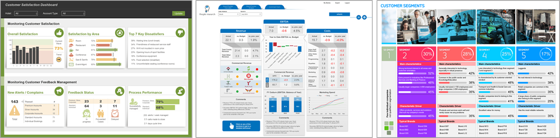
- The term ‘dashboard’ can be a misnomer – we regularly create broader, more detailed ‘interactive dashboard reports’ that include all research questions beyond just key metrics (NPS, NSAT, OSAT, etc.)
- Shortened time to insights – dashboard reporting connects directly to data sources so the results are automatically generated into charts, tables, etc. There is less time spent on chart population and data entry, which leaves more time to understand the data and focus on identifying key insights.
- The data ‘lives’ on through filtering and pivoting capabilities that enable users to get richer insights out of their data over time – additionally, new chart types, data filters, and click-through capabilities can be added on the fly as new requirements or the need for additional data views arise.
- Answer questions with just a few clicks – there always seems to be that one question you cannot answer on the spot because the data is not at your fingertips. Dashboard reporting facilitates data exploration and allows other research stakeholders to participate in the analysis process.
- Engage your research stakeholders by providing them with access to their own interactive reports and key performance indicators (KPIs) that are relevant to their specific needs (i.e., different geographies, accounts, product areas, roles, etc.).
- Some dashboard reporting tools allow for export of charts to PowerPoint as well as cross-tab creation functionality.
That all sounds great, so why are we not using interactive dashboards for every research report? We think there are several reasons why:
- Designing a well-functioning dashboard report is no small feat and generally takes more time to develop than a typical research report in PowerPoint. To offset this, we often begin designing a dashboard wireframe before or while data collection is in progress, so that results are available soon after the final data set is ready. Additionally, some of our more nimble dashboard/interactive reporting tools allows us to develop dashboard reports in the same time it takes to create a PowerPoint report. Either way, it still takes iteration to get it right and timing will vary depending on the depth of the reporting requirements.
- Chart headlines, summaries of key findings, and recommendations that are part and parcel to research reports in PowerPoint are not usually included with dashboard reporting (because the results change as you filter data), so it can be difficult for users to get a firm grasp of the research storyline without the guidance of written findings.
- Not everyone wants to be ‘hands on’ when it comes to analyzing the results and searching for additional insights.
- Despite dashboard reporting being around for years, it can be hard to break tradition with PowerPoint reporting (i.e., will stakeholders be willing to open a link and login into a dashboard to see reports?).
- Lastly, some dashboard tools require an investment in software licensing that can be prohibitively expensive for a typical ad-hoc project.
So when should you use dashboard reporting? Interactive dashboard reporting is particularly beneficial when your research needs call for ongoing/long term ‘tracker’ studies (i.e., CX research, customer satisfaction, brand awareness, etc.) that can benefit from reporting efficiency across waves – once the dashboard is created, the results are automatically updated and immediately available with each new wave of data collection. One of our clients utilized a dashboard to understand ongoing consumer engagement with one of its products that had low involvement and where key competitors had a stronghold on awareness. We created a dashboard that regularly tracked key metrics to keep a pulse and measure awareness changes over time. The dashboard consistently analyzed activity so that the client could quickly identify key weaknesses versus its competitors and quickly take specific actions to strengthen its positioning.
Dashboard reporting is also valuable when you need to produce multiple reports for different markets, product areas, etc. Once the dashboard report is developed, results can be automatically re-distributed for the different business areas. This has the advantage of decreasing time to insights because there is no manual replication of data entry and report development.
We have also developed smaller dashboard reports to provide our clients with some early views of the results leading up to a more detailed deliverable. For example, we recently provided a dashboard report so one of our clients could see how results were unfolding throughout data collection. The dashboard allowed the client to start some early thinking about potential storylines for a thought leadership article that had a quick timeline.
Finally, we think a dashboard can be a powerful approach/tool for circulating data and supporting better business decisions. If these benefits sound relevant, maybe consider a dashboard for your next study.